Monday, 28 November 2016

Sunday, 20 November 2016
Assignment #2: Data Update 3
Hello,
In my last Data Update, I used Datawrapper to show how mobile phone use in Botswana has far outpaced Canada's in the last ten years.This will constitute the central point of my final report.
As you see, Botswana overtook Canada in 2007, then continued to grow at a fast rate. I will explain the reasons in my final report.
One question that I cannot answer with my data is:
How does mobile cellular subscription compare to fixed-telephone subscription for Botswana and Canada?
The type of dataset to help me answer this question will show the number of fixed-telephone subscribers (per 100 people) in Botswana and Canada. I will be getting the data from the International Telecommunication Union(ITU) (see fixed-telephone subscriptions).
In my last Data Update, I used Datawrapper to show how mobile phone use in Botswana has far outpaced Canada's in the last ten years.This will constitute the central point of my final report.
As you see, Botswana overtook Canada in 2007, then continued to grow at a fast rate. I will explain the reasons in my final report.
One question that I cannot answer with my data is:
How does mobile cellular subscription compare to fixed-telephone subscription for Botswana and Canada?
The type of dataset to help me answer this question will show the number of fixed-telephone subscribers (per 100 people) in Botswana and Canada. I will be getting the data from the International Telecommunication Union(ITU) (see fixed-telephone subscriptions).
Monday, 14 November 2016
Monday, 31 October 2016
Assignment #3: Data update 2
Opening “lead" sentence: Botswana mobile penetration rate is twice Canada’s
A link to my excel book can be found here. Please note that it contains the following:
Since my objective was to filter to countries in Sub-Saharan Africa and North America only, I used the Metadata as my reference table to find the corresponding region using the country code.
The data source can be found here, and by clicking on the download tab. My initial data source did not provide mobile cellular phone subscription per 100 people. As per feedback from my instructor, the new data set is better for my Data Visualization project.
I found a news story that provided an explanation to why Botswana has one of the highest mobile penetration rates in Africa. The article discusses the findings of a study titled "Botswana - Telecoms, Mobile and Broadband - Market Insights and Statistics" which credits the growth to regulatory reforms that has turned Botswana's telecom market into one of the most liberalized in the region.
A link to my excel book can be found here. Please note that it contains the following:
- Raw Data: Original data-Mobile cellular subscriptions (per 100 people) downloaded from The World Bank.
- Slice 2: Contains my data that backs up my conclusion and lead sentence. This slice contains data for mobile use in Sub-Saharan Africa and North America.
- (For information purposes only) Slice 1: Data with two new columns -Region and Income group derived using VLOOKUP function.
Since my objective was to filter to countries in Sub-Saharan Africa and North America only, I used the Metadata as my reference table to find the corresponding region using the country code.
The data source can be found here, and by clicking on the download tab. My initial data source did not provide mobile cellular phone subscription per 100 people. As per feedback from my instructor, the new data set is better for my Data Visualization project.
I found a news story that provided an explanation to why Botswana has one of the highest mobile penetration rates in Africa. The article discusses the findings of a study titled "Botswana - Telecoms, Mobile and Broadband - Market Insights and Statistics" which credits the growth to regulatory reforms that has turned Botswana's telecom market into one of the most liberalized in the region.
Saturday, 15 October 2016
Assignment #2: Data update 1
Hello,
In my second blog entry, I will talk about my idea for my Final Report Data Report due on December 5th,2016. Here are my answers to the four questions posed by our instructor.
1.What dataset will you use for your final report? (describe your
dataset, include a link to it and claim it at the URL above).
For my final report, I will be analyzing the use of mobile phones in Sub Saharan Africa. The dataset that I plan use will be retrieved from the International Telecommunication Union(ITU). Furthermore, I will also get additional data on total population, GDP and population with access to electricity in Sub-Saharan Africa from the World Bank. By reviewing both data set, I should have a good insight on the future outlook of mobile phones in Sub Saharan Africa.
I will also use online articles to support my arguments on the data. My early research on the topic shows that mobile phones have allowed Sub Saharan Africa to jump into the digital age by skipping the normal progression from landlines to mobile phones as seen in the West. I am excited to analyze the dataset, and use data visualization tools to share my findings.
2. Describe the dataset. What kind of data does it contain?
I will combine dataset from multiple sources. The dataset from ITU contain mobile-cellular and fixed-telephone subscriptions by country from 2005 until 2015. Both dataset show the number of mobile cellular and fixed-telephone subscriptions in millions and per 100 inhabitants by country.
Dataset from the World Bank contains a number of key indicators such as the percentage of total population in Saharan Africa from 2005 to 2015. This dataset will be useful when looking for answers on correlation between development and mobile phone use in Sub Saharan Africa.
3. Is there anything about your data that you don’t understand? (i.e.
what a column heading means). How will you find this out?
My data is straightforward. ITU and the World Bank do an excellent job in explaining all key indicators in their data. Since I plan to focus on Sub-Saharan Africa, I will need to filter my data to those countries only. The World Bank provides a list of countries in Sub-Saharan Africa.
4. What are some questions you hope to answer with your data? List at
least three. (you don’t need the answers at this point)
- What is the growth rate (if any) over the last ten years of mobile-cellular subscriptions in Sub Saharan Africa?
- How does this trend in mobile-cellular subscriptions compare to fixed telephone subscriptions?
- Knowing that Sub Saharan Africa is considered a developing region, what conclusions can we make about mobile-cellular subscriptions and development?
- What are the top 10 countries in Sub Saharan Africa with most mobile-cellular subscribers? Are these countries the most competitive economies in Sub Saharan Africa?
Sunday, 25 September 2016
Assignment #1: Data Visualization Analysis
I found this awesome map on Dr. Stephen Hicks's website. This map was created by Gapminder - a non profit foundation that promotes sustainable global development and achievement of the United Nations Millennium Development Goals by increased use and understanding of statistics and other information about social, economic and environmental development at local, national and global levels.

My first reaction was 'wow '! This map shows a lot of data on health (life expectancy at birth) and money (GDP per person in US dollars) for almost all the countries in the world. This map does a fantastic job in showing information for countries that I would not have imagined. For example Qatar, which can be seen on the top right. However when I started looking for patterns in the data, I quickly got confused.

The X axis of this map starts at 45 years instead of zero. One can make many misinterpretations about the relevance of life expectancy at birth when comparing data between countries. For example, how can I better understand the gap of life expectancy at birth between Zimbabwe and Afghanistan? This leads to my other questions. Since this map is static, how do I see a clear gap in life expectancy between countries by continent ? What do bubble charts represent?
The use of colours by region is probably not necessary since the map has many countries that are scattered all over the map. In fact, when I first read the map, I initially thought that countries were placed on the image as per the World Map. It took me a while to understand this map. Some colours are also too strong. For instance, I find that yellow is a colour that is hard to look at.
3 This map's strength is in showing many complex information (low-income to high income countries, life expectancy at birth, GDP, and population) on a single image. However, its usefulness can be enhanced by creating a simple and interactive map.
Let's take a look at a similar map on Tableau public.
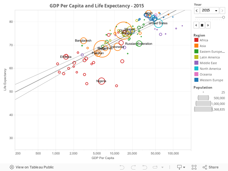
I can already see the benefits of using Tableau to create a powerful and simple interactive chart or map. Some principles on Data Visualisation that I have learned so far such as 'keep it simple' or 'tell folks how it works' could have been applied on the map created by Gapminder to generate a more useful map.
Subscribe to:
Posts (Atom)