I found this awesome map on Dr. Stephen Hicks's website. This map was created by Gapminder - a non profit foundation that promotes sustainable global development and achievement of the United Nations Millennium Development Goals by increased use and understanding of statistics and other information about social, economic and environmental development at local, national and global levels.

My first reaction was 'wow '! This map shows a lot of data on health (life expectancy at birth) and money (GDP per person in US dollars) for almost all the countries in the world. This map does a fantastic job in showing information for countries that I would not have imagined. For example Qatar, which can be seen on the top right. However when I started looking for patterns in the data, I quickly got confused.

The X axis of this map starts at 45 years instead of zero. One can make many misinterpretations about the relevance of life expectancy at birth when comparing data between countries. For example, how can I better understand the gap of life expectancy at birth between Zimbabwe and Afghanistan? This leads to my other questions. Since this map is static, how do I see a clear gap in life expectancy between countries by continent ? What do bubble charts represent?
The use of colours by region is probably not necessary since the map has many countries that are scattered all over the map. In fact, when I first read the map, I initially thought that countries were placed on the image as per the World Map. It took me a while to understand this map. Some colours are also too strong. For instance, I find that yellow is a colour that is hard to look at.
3 This map's strength is in showing many complex information (low-income to high income countries, life expectancy at birth, GDP, and population) on a single image. However, its usefulness can be enhanced by creating a simple and interactive map.
Let's take a look at a similar map on Tableau public.
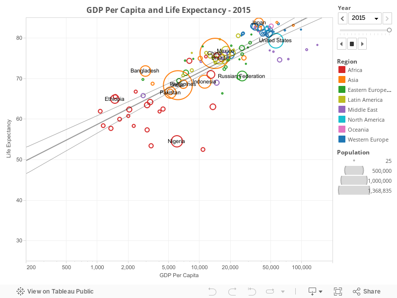
I can already see the benefits of using Tableau to create a powerful and simple interactive chart or map. Some principles on Data Visualisation that I have learned so far such as 'keep it simple' or 'tell folks how it works' could have been applied on the map created by Gapminder to generate a more useful map.